Yes, you’ve read it right. We’ve just compared one of the classic buzzword phrases (which quite often isn’t well defined) with one of the greatest film artists ever.
Before you click the dislike button, give us one minute, it makes sense (we swear).
Through this article, we aim to bring to light something that is often seen as conning the end user. We want to explain why the Graphic Standards Book (or Brand Book if you are a little more modern) isn’t really a “catch” with which the designer/agency wants to trick you into paying more, but something that every brand needs. To a certain extent.
Brand Image Building, as we understand it, is the building of brand identity. Identity is actually an easier way of saying “how people see my brand”. And it is built through every brand campaign, from defining colours and fonts used in the logo, through CSR activities, to PR articles about the private life of someone with a C_O position at the company.
This time, due to the length of the text (because we really want you to read it), we will focus only on the first example: visual identity and brand presentation.
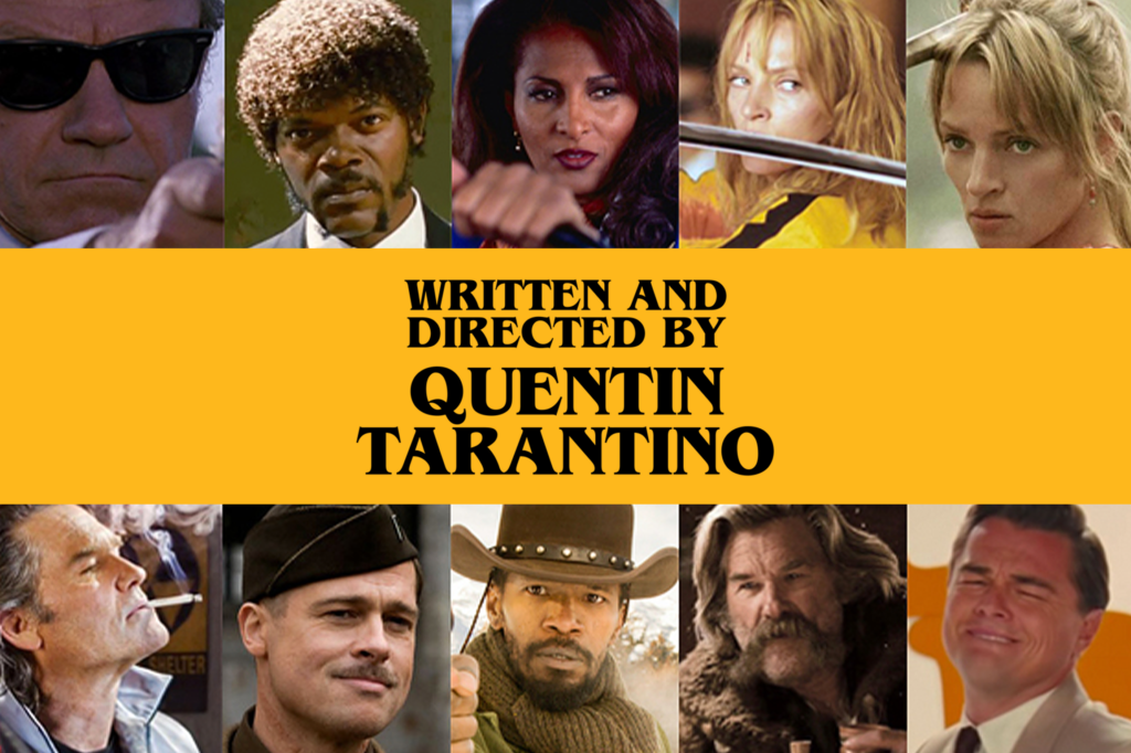
What springs to mind first when you hear “Tarantino’s film”? An animated cartoon that you watch on a Friday night with your little ones, or “oh, another mind-blowing thriller with lots of blood and even more tension”? This is what differentiates Tarantino and his films from all others.
Also, it’s not something Tarantino had in the beginning. It took a lot of time and effort for him to become a trademark of the thriller genre. Just as it takes time and effort (or crazy luck) to achieve great success in the film industry, these are also essential items for the success of any business (except for luck – you need that even more).
But you also need to make good moves throughout the process.
And they have a particularly big impact at the beginning.
For example, defining branding is literally the first thing a business will do that will be visible to the public. Of course, there is always the possibility of rebranding later on, but that also extends the period needed to position yourself in the market as a brand, because you are practically starting from scratch. Since all of this seems very abstract, I will reveal to you a “secret” about how we approach any branding project:
Imagine a person.
That’s it.
So, before we start determining colours, layouts, fonts, logo illustrations, etc., we always first think of that brand as a real person. The traits of that person represent the traits of the brand.
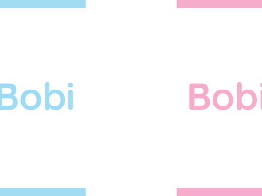
To better illustrate, let’s say that the client we work for opens a baby equipment company and has decided to call itself “Bobby”. Also, in order to get a more complete picture, we like to meet the person behind the brand because it is also one of the important aspects that we like to factor into defining a brand.
Then we sit down and start thinking about who Bobby is. After half an hour (or more likely 2 hours) we have something like this: Bobby is a character who is gentle, nice, a little chubby, but reliable, well-dressed and quite reasonable. He is here to help with anything you need, he is aware of all your problems and knows how to solve them. When he greets you, he prefers hugging to shaking hands, but you have no problem with that because you feel like you have slipped into a fragrant pillow. Okay, so how do we present that visually? And why is he chubby? He is chubby because he is harmless. He is not big (muscular), professional or dressed in a suit, but is there as your very good and loving friend.
Now comes the visual part.
The “nice and gentle” features can easily be turned into colours. Considering that this is a brand of baby equipment, the most logical thing would be to use light blue and baby pink. “He’s warm, loves hugs and is a little chubby” is a font we can use for writing. So, we will have some kind of bold font, but instead of sharp edges, it will have curved ones. The “well-dressed, reliable, and quite reasonable” part communicates that we don’t shouldn’t go overboard with the rounded, fluffy elements in order to keep the logo clean and easily read. Ultimately, we get something like this:
And that’s it, personification of a brand in 3 steps… Okay, in 1 step, but it’s long, so we better say 3.
Now let’s turn everything on its head and look at actors – people who change their appearance and personality as part of their profession.
Unless they are Dwayne Johnson. (yes, you’ve guessed it, we won’t turn anything on its head, we’ll talk about The Rock)

Dwayne Johnson is an actor who plays himself in every movie. It doesn’t matter that the name of his character is Luke Hobbs or Mitch Buchannon, he is The Rock. Of course, this does not mean that Dwayne Johnson is a bad actor or that he would not do well in a different role. It just means that The Rock has turned himself into a very recognizable brand. And that’s what every brand should aim for.
When it comes to visual identity, this is greatly aided by Brand Book.
The basic elements of each Brand Book are:
- Logo geometry
- Definition and correct use of colours
- Definition and correct use of fonts
- Definition and correct use of the logo itself
- Definition of additional elements and their use (e.g. triangle above the letter “Š” in our logo)
- Identifying and explaining the incorrect use of logos
Each of these elements serves to ensure that whenever company branding appears, it is always the same, i.e. unified. Brand unification contributes to the frequent occurrence of elements of your brand entering the subconscious of people and then, as soon as someone looks at anything containing it (whether in the form of logos, slogans or some additional elements), people instantly recognize it and remember you.
One of the good platforms for this example is Instagram. If, over a longer period of time, regardless of the creatives themselves, you always have a recognizable element that always stands in the same place, people will know who posted it without having to read the name of your page in the upper left corner. In particular, this example of unification can have a huge impact in the campaigns themselves.
You can check out Coca-Cola Serbia’s profile on Instagram as one example of this type of campaign.
You will find that each of the content strands, or the different topics they cover, is unified in some way.
For the same reason, but in the film industry, people always associate certain actors with their roles. In addition to The Rock, we can see that with Schwarzenegger and Danny DeVito, especially in the movie “Twins” where they both play the extremes of stereotypes that people connect them with.
That would be all for this article, it’s gone on long enough already…
In fact, we will end with a fun fact:
You will notice that throughout the article, we did not write “target group” anywhere, but always chose “people” instead. Why?
The target group of the product/service is often very different and much smaller than the total mass of people who will hear about your brand. For example, every person over the age of 5 (some even under) knows that a Ferrari is a highly prestigious, rare and fast car, even if they are unable to buy it. And that’s one of the main things that keeps that brand alive.
The very idea of how prestigious Ferrari is represents a highly important motive for buying it, resulting in Ferrari cars being much more a symbol of prestige than a means of transportation. Which is not a bad way to position your brand (to build its image).
So, if you want your brand to be recognizable, watch “Once Upon a Time in Hollywood”. Or be a Ferrari, whatever makes more sense to you.